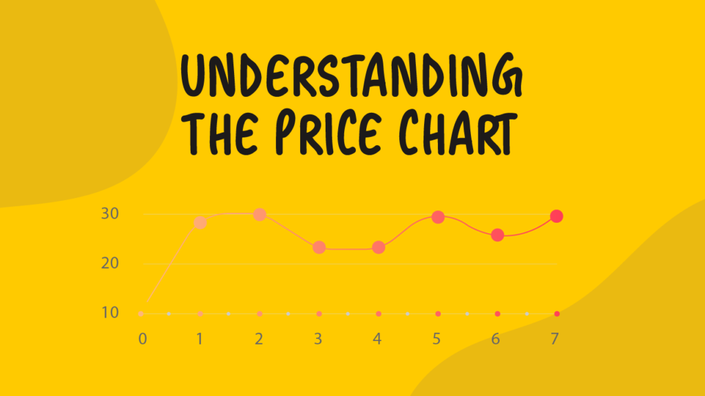
One of the most common problems that traders face is understanding a price chart. As we all learned in school, data can be deceiving. It all depends on how its presented. In the case of your average price chart, it will tell you what the price of a certain instrument is at a certain point in time.
As such, traders are commonly susceptible to the folly that occurs during major price spikes. Price action is dictated in percentages. Many professional traders will look for the percentage change in pricing to identify their risk and potential areas in which they may enter the markets.
As previously mentioned in our article regarding identifying trends, we have mentioned that trends can either go up or down. However, one must also take note of the pace in which a trend can go up or down.
For example, one might assume that Bitcoin, the world’s leading cryptocurrency, is accelerating at a fast pace. However, when one looks into the percentage change in price it is of reasonable value. That is why when many traders and investors exited the market early, it was simply just an emotional response.
Take a look at the chart below. This is known as an arithmetic scaled chart. What one would see is that it would be difficult to identify a trend line and therefore it would make it difficult to find exits or entries into this market.
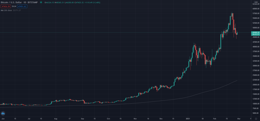
Coupled with a chart that appears to have an accelerating trend and rumors of a bubble, and many miss out on capitalizing on the ride to the top of the market.
Take a look at this next chart below. This chart is in the logarithmic scale. The logarithmic scale helps professional traders to identify percentages in price change. Thus, towards the top of the chart, you will notice that the prices on the Y-Axis are getting closer to each other in relevance to the previous price.
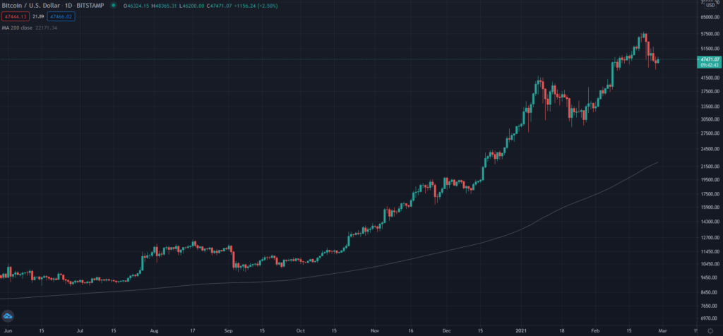
As the data is scaled nicely due to the logarithmic formula, this makes it easier for traders to identify supports, resistances and trending supports and resistances. Mapping out these lines is easier, and the data is presented in a form that doesn’t evoke the counterproductive emotions.
Bear in mind that prices will fluctuate mainly based on percentages and not on the intrinsic value of the instrument. By doing so, if an instrument such as Bitcoin (BTCUSD) is priced at 45,000 and increases in value to 47,000 it wouldn’t be considered to be as ridiculous as many make it out to be.
When you understand a price chart, you may be able to use it and delve further into the world of technical analysis that will help you minimize your risks and maximize your profitability.